Two Products Cards Component
The Two Products Cards component is designed to showcase two products side by side, allowing editors to highlight key features and benefits of each product in a visually appealing way. This component is ideal for comparison pages, solution overviews, or any scenario where you want to present two products together.
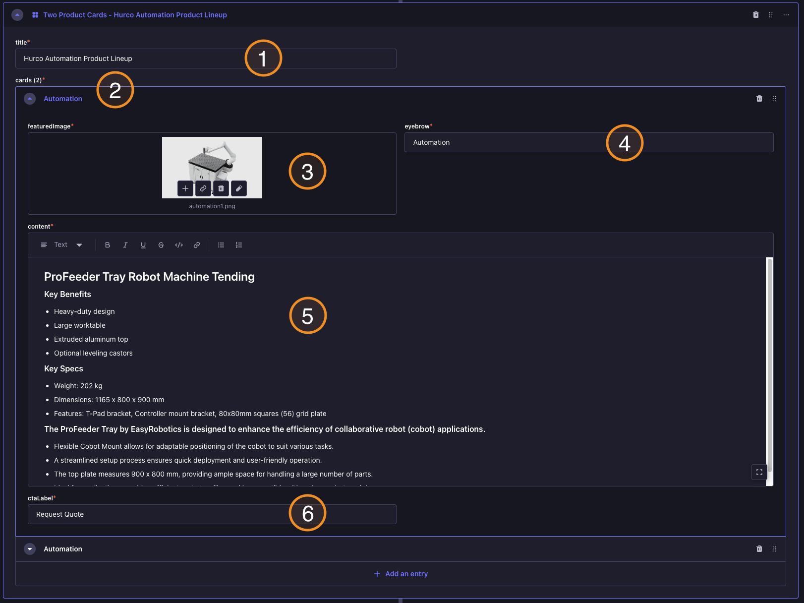
Backoffice View:
Frontend View:
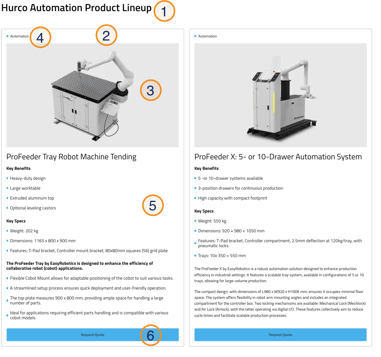
Caption:
- Title: A headline for the section, providing context for the products being showcased.
- Product Cards: Two separate cards, each containing:
- Product Image: A visual representation of the product.
- Eyebrow: A small label above the product title, often used for categorization or highlighting a key aspect.
- Content - A brief description of the product, highlighting its main features and benefits. This field is a Rich Text Editor, allowing for formatted text and links.
- CTA Label: A call-to-action button label that opens "Request a quote" form when clicked.