Card Grid
The Card Grid component displays a section with a title, a supporting description, and a grid of feature cards. It is ideal for showcasing product categories, training programmes, service offerings, or any group of items that benefit from a visual grid layout.
The component is available in the Content zone of the Content Page Collection Type.
Overview
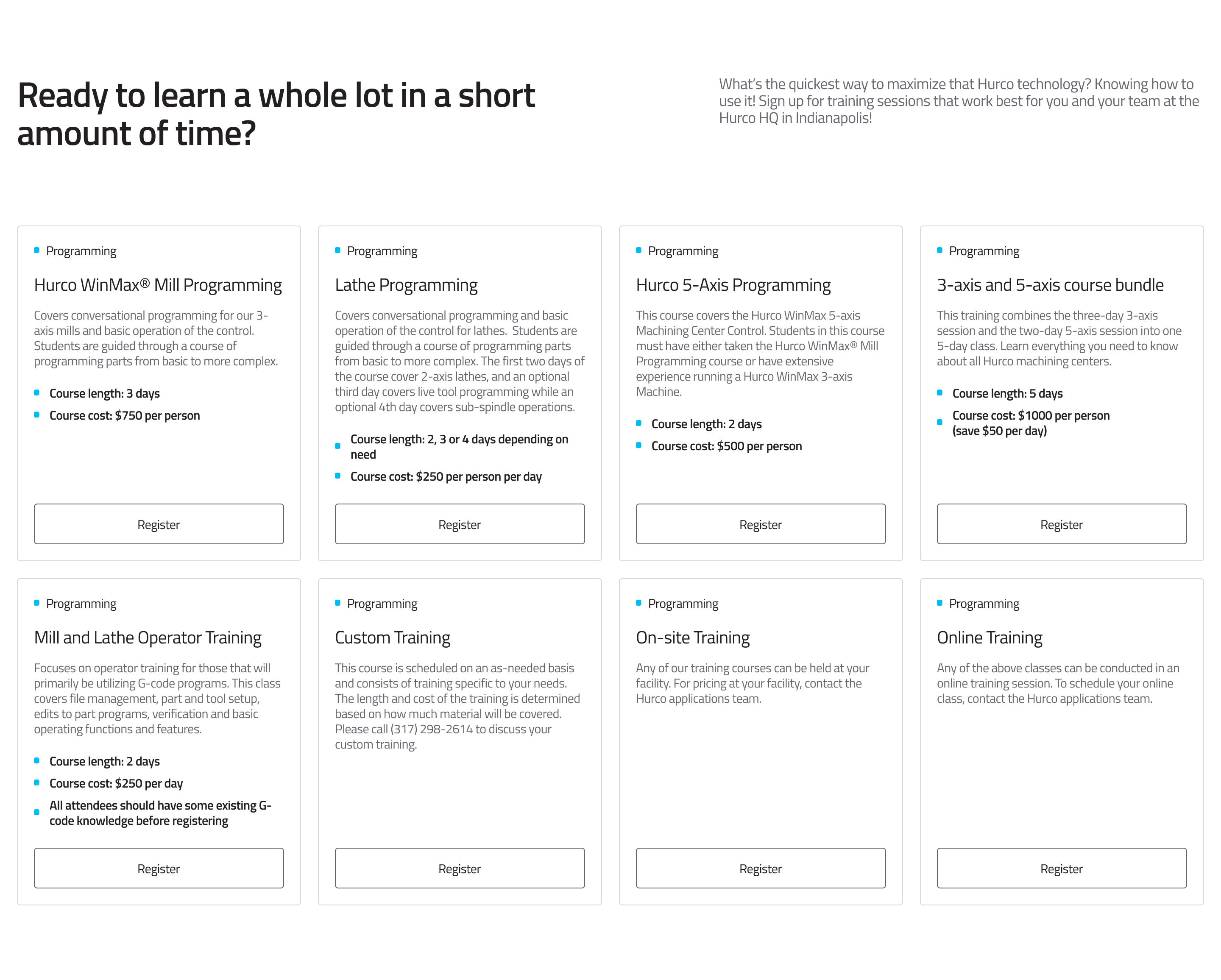
On desktop, cards are displayed in a responsive grid — 2 columns on medium screens, expanding to 4 columns on large screens. Each card stands at a consistent height with its call-to-action button pinned to the bottom.
Desktop view:
On mobile, the cards collapse into a stacked accordion. The first card is open by default; tapping a card header expands it to reveal the description and CTA button.
Mobile view:

Fields
Section level
-
Section Title (required) — The main heading displayed at the top of the section.
-
Section Description (required) — Supporting text displayed beside the section title. Keep it concise — one or two sentences.
-
Cards (required) — A repeatable list of cards. Add as many cards as needed; the grid reflows automatically.
Per card
Each card inside Cards has the following fields:
-
Eyebrow (required) — A short label displayed above the card title (e.g. a category or tag such as Training or Service). Rendered with a small coloured dot prefix.
-
Title (required) — The main heading of the card.
-
Description (required) — The body content of the card. Supports rich text including bullet lists. Bullet list items are automatically styled with the brand dot prefix.
-
CTA URL (optional) — The destination for the call-to-action button. Accepts:
- Internal paths:
/training - External URLs:
https://example.com - Email links:
mailto:info@hurco.com - Phone links:
tel:+441234567890
warningIf CTA URL is left empty, no button will be rendered on the card.
- Internal paths:
-
CTA Label (optional, defaults to "Register") — The text displayed on the call-to-action button. Only shown when a CTA URL is also provided.
Usage
- Use the Eyebrow to give each card a quick category signal before the user reads the title.
- Keep Titles short — one line is ideal.
- Use bullet lists in the Description for scannable feature lists or step-by-step points.
- Provide both CTA URL and CTA Label together — neither renders without the other.
- Aim for an even number of cards (2 or 4) to fill the desktop grid symmetrically. Odd numbers will leave an empty cell on the last row.
Best Practices
- Keep card counts to multiples of 4 where possible for a balanced desktop grid.
- Use consistent eyebrow labels across cards to reinforce visual grouping.
- Avoid very long descriptions — the accordion format on mobile means content should be digestible at a glance.
- Use the default CTA label "Register" for training cards or override it to match the action (e.g. "Learn more", "Contact us").
For more guidance on publishing content and best practices, check out our Publishing Content Guide.