Split Section
This guide explains how to use the Split Section component in the Hurco Backoffice to manage split-layout content blocks on your website.
The component is available in the Content Page Collection Type. It renders a two-column section that adapts its layout depending on whether a media image is provided.
Layouts
The Split Section has two layout modes that are automatically applied based on whether a Media image is set:
With Media
When a media image is provided, the section renders the image on the left and the text content (eyebrow, title, description, and CTA) on the right.
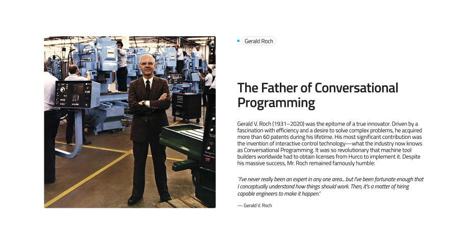
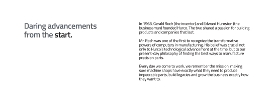
Website view — Split Section with Media:
Without Media
When no media image is provided, the section renders a two-column text layout: eyebrow and title on the left, description and CTA on the right.
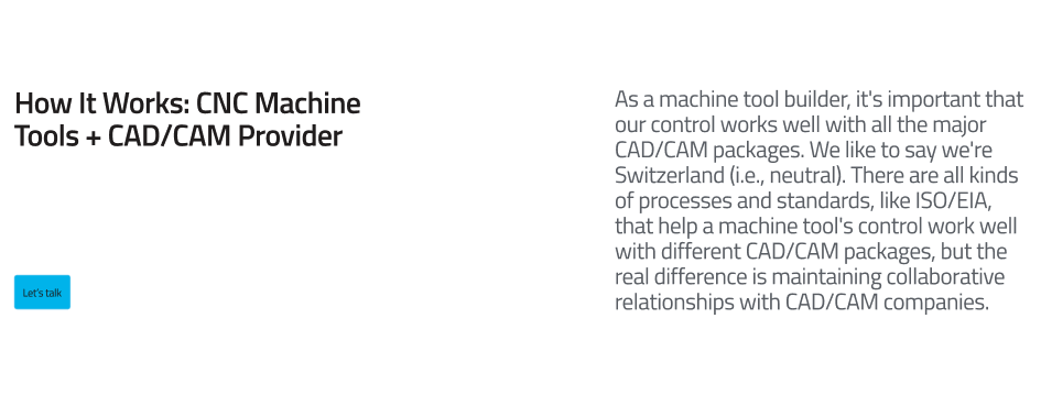
Website view — Split Section without Media:
Fields
Caption:
-
Eyebrow (optional) – A short label displayed above the title as a small tag/badge. Used to categorise or introduce the section topic.
-
Title (optional) – The main heading of the section. Supports rich text formatting, including bold emphasis for styled highlights.
-
Description (required) – The body text of the section. Supports rich text formatting.
-
Media (optional) – An image displayed alongside the text content. When set, it appears on the left side of the section (5/12 width on desktop). When omitted, the text occupies the full two-column layout.
-
CTA (optional) – A call-to-action button. Composed of:
- Label – The button text.
- URL – The destination link.
- Variant – The visual style of the button (e.g.
default,outline).
-
Theme (required) – Controls the colour scheme of the section. Options:
light– White/neutral background with dark text.dark– Dark background (neutral-90) with light text.
Theme Examples
Light theme:
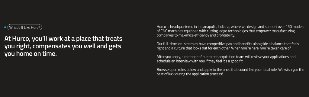
Dark theme:
For more guidance on publishing content and best practices, check out our Publishing Content Guide.