Accordion Block
The Accordion Block component displays a list of collapsible sections (accordion cards), each with a title and content. It is ideal for FAQs, support topics, or any grouped information that benefits from being expandable/collapsible.
Fields
- Title: The main heading for the block (e.g., "Support & Troubleshooting").
- Accordion Cards: A list of cards, each with:
- Title: The heading for the card (e.g., "My Post Won't Work! Who Can Help?").
- Content: The detailed information shown when the card is expanded. Supports rich text and links.
- CTA Label (optional): Call-to-action button text.
- CTA URL (optional): Link for the call-to-action button.
Usage
- Use the Accordion Block to organize FAQs, troubleshooting steps, or grouped content.
- Add a clear title for the block and descriptive titles for each card.
- Use the content area for detailed explanations, instructions, or links.
- Add CTAs if you want users to take action from a card.
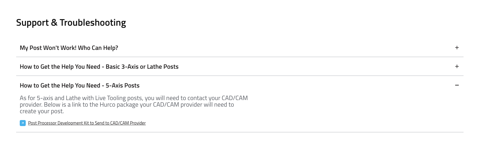
Example (Website View)
Best Practices
- Keep card titles concise and clear.
- Use the content area for helpful, actionable information.
- Group related topics together for easier navigation.
- Use CTAs sparingly and only when they add value.