Navbar Fields Explained
This page explains the fields available for the Navbar content in the Global single type, based on the current frontend implementation. It covers the purpose of each field and how it affects the website's navigation structure and behavior.
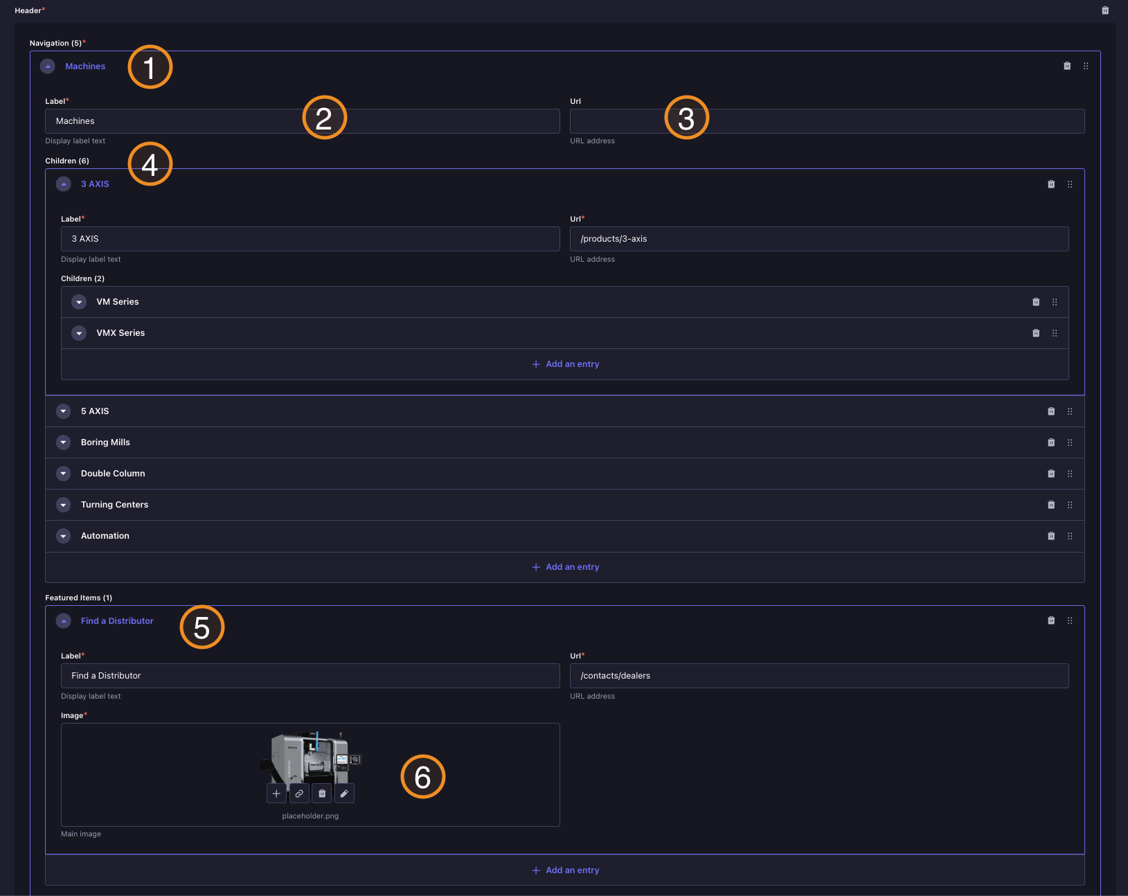
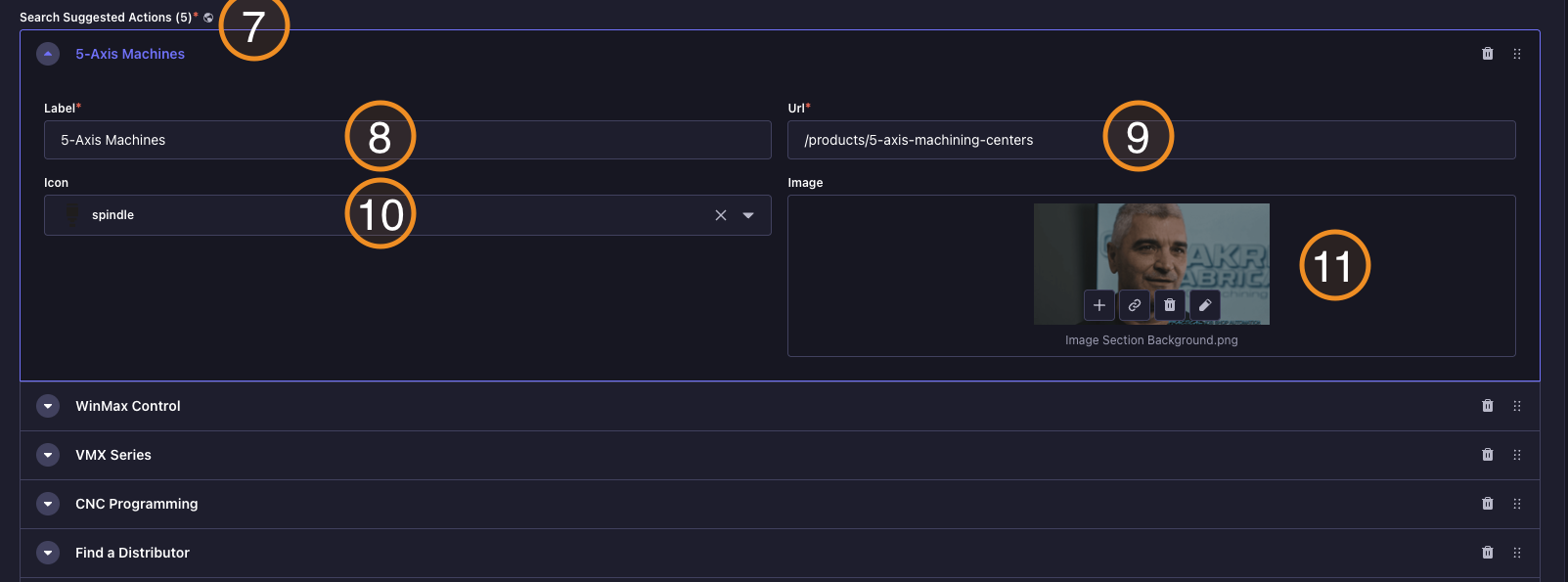
Backoffice View
Website View
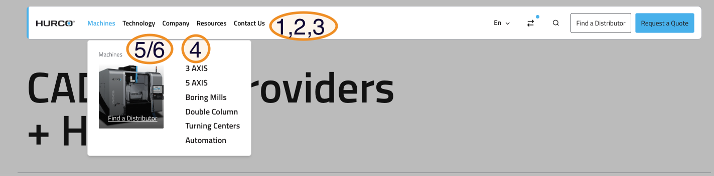
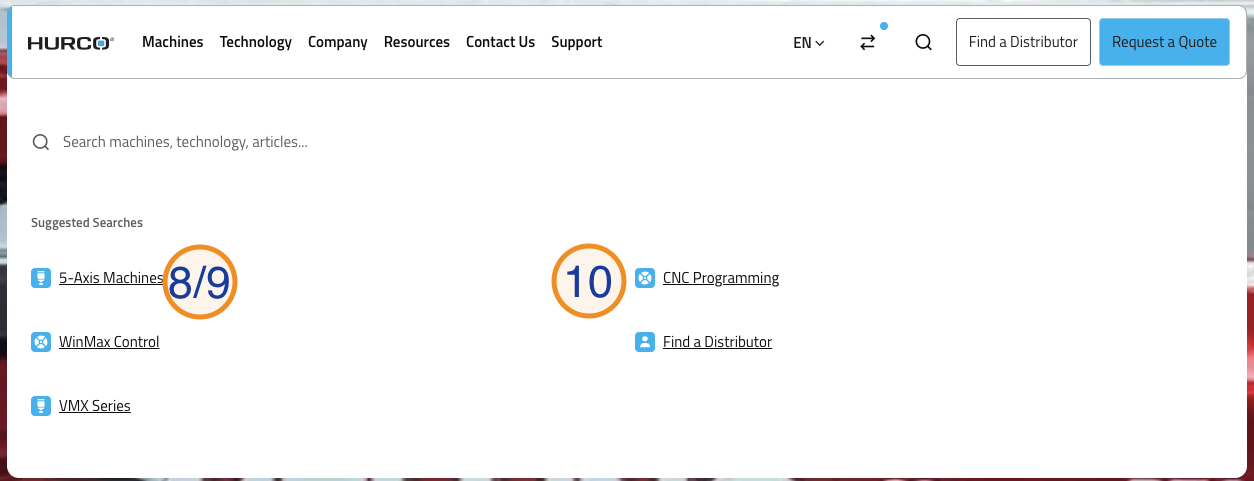
Caption
- Navigation Item: Adding a new entry to the navbar. Each item can be a simple link or a dropdown trigger.
- Label: The text shown in the navbar for this item.
- URL: The link target for this item when it is a simple link.
- Children: Optional submenu items that create a dropdown when added.
- Featured Items: Optional visual cards that can be added to a dropdown.
- Featured Item Image: An optional image for featured items, shown in some dropdown designs.
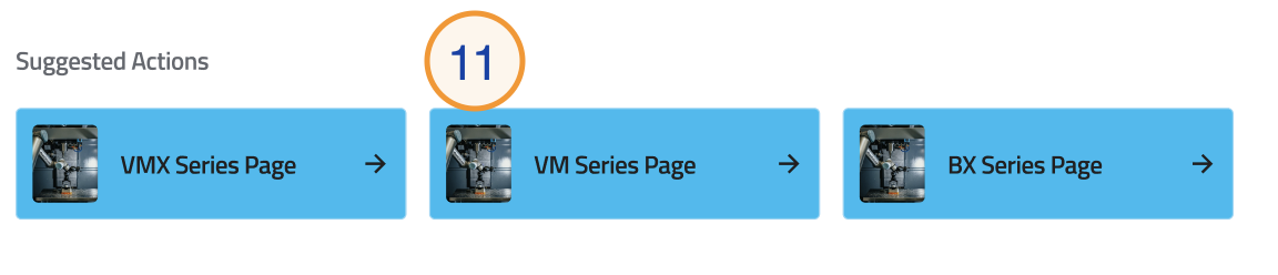
- Suggested Actions: This component allows users to add suggested actions to the search dropdown. Each suggested action has the following fields:
- Label: The visible text for the suggested action.
- URL: The destination page when the suggested action is clicked.
- Icon: An icon to visually represent the suggested action in the dropdown.
- Image: An image that can be displayed alongside the suggested action in the search page Suggested Actions section.
Child Link Fields
Each child link inside a dropdown has the following fields:
- Label: The visible link name.
- URL: The destination page.
- Link Description: Optional supporting text displayed below the label in the mobile menu.
- Children: Optional deeper sub-items (series level).
- See All Link: Optional CTA shown at the bottom of the mobile series level. Has two sub-fields:
- Label: The button text (e.g.
See All Machining Centers). - URL: The destination page.
- Label: The button text (e.g.