Navbar Management
The navbar is the main navigation shown at the top of the website. It is managed in the Global single type and supports simple links, dropdown groups, nested navigation links, and featured promotional items.
Where to Edit the Navbar
- Open the Content Manager.
- Open the Global single type.
- Scroll to the Header section.
- Edit the Navigation items inside the Header component.
The Header section controls the main navigation structure used in the desktop and mobile menus.
How the Navbar Works
Each top-level navigation entry can behave in one of two ways:
- Simple link: if the item has a label and URL, and no children or featured items, it is rendered as a direct link in the navbar.
- Dropdown menu: if the item contains child links or featured items, it is rendered as a hover dropdown instead of a direct link.
In practice, this means you can use the same navigation area for:
- Standard page links such as Resources.
- Large product menus with grouped child links.
- Dropdowns with promotional featured cards, such as a machine image linking to an important page.
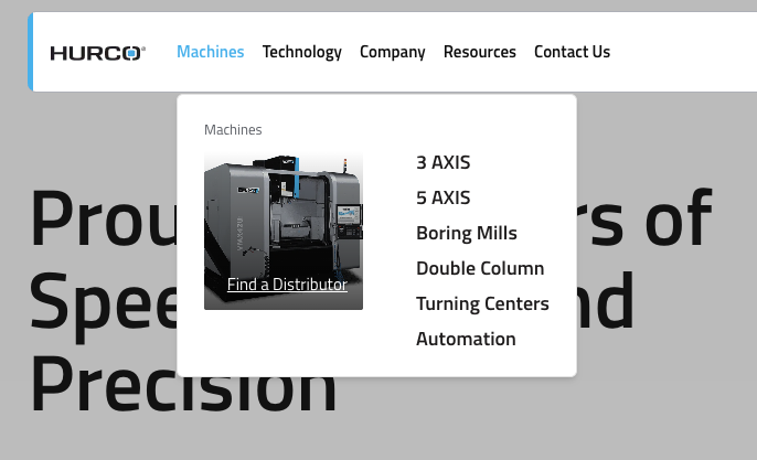
Example -
This is how a dropdown with featured items appears in the frontend:
Navbar Structure
The frontend uses the following structure from the Header component:
- Top-level navigation items
- Child links inside dropdowns
- Featured items displayed visually inside some dropdowns
Top-Level Navigation Items
Each top-level item is a menu entry in the Header navigation list.
Fields
- Label: The text shown in the navbar.
- URL: The link target used when the item is a direct link.
- Children: Optional submenu items. If this field contains entries, the item becomes a dropdown trigger.
- Featured Items: Optional visual cards shown inside the dropdown.
Important Behavior
- A top-level item must have a Label to appear.
- If the item has Children or Featured Items, the frontend renders it as a dropdown button, not as a direct link.
- If the item is a simple link and the URL is empty, the frontend falls back to
#, so the item will not lead to a useful page.
Child Links Inside Dropdowns
Child links are the links displayed inside a dropdown panel.
These are useful for organizing pages below a main category, such as:
- 3 AXIS
- 5 AXIS
- Boring Mills
- Turning Centers
Child Link Fields
- Label: The visible link name.
- URL: The destination page.
- Link Description: Optional supporting text shown for some child links.
- Children: In structured menus, links can also contain deeper nested items.
- See All Link: Optional CTA link shown at the bottom of the third-level mobile menu when the user navigates into this child's sub-items. Requires a Label and URL.
Use child links when the top-level navigation should open a menu instead of sending the visitor directly to a page.
See All Link Behavior
The See All Link field on a child link allows editors to add a "See All" call-to-action that appears at the bottom of the mobile navigation when a user drills into that child's sub-items.
Example: If "Machining Centers" has a See All Link configured with label See All Machining Centers and URL /products/machining-centers, a button with that label and link will appear at the bottom of the series list when a mobile user opens Machining Centers.
- This field has no effect on the desktop dropdown.
- It only appears in the mobile menu at the deepest level of navigation.
Featured Items
Featured items are promotional cards that can appear inside a dropdown next to the navigation links.
They are designed for high-visibility links.
Featured Item Fields
- Label: The text shown on the card.
- URL: The page opened when the card is clicked.
- Image: The background image displayed on the card.
Important Behavior
- A featured item only appears if it has a Label, URL, and Image.
- The image is shown as a square visual card with the label overlaid on top.
- Featured items are optional. A dropdown can contain links only, featured items only, or both.
Mobile Menu
The mobile menu shares the same Header configuration as the desktop navbar. It renders a slide-in drawer with a stacked navigation experience:
- Level 1 (root): Top-level navigation items.
- Level 2: Child links inside a top-level dropdown.
- Level 3: Sub-items nested inside a child link (series level).
Featured Items in Mobile
Featured items appear at the top of the menu level where they are configured, above the regular navigation links. Tapping a featured item closes the mobile menu.
See All Link in Mobile
If a child link (level 2) has a See All Link configured, a CTA button appears at the bottom of the level-3 item list when the user navigates into that child.
Closing Behavior
The mobile menu closes automatically when the user taps:
- A navigation link (leaf node)
- A featured item
- The Compare or Search links
- The Find a Distributor or Request a Quote buttons
What Editors Can Change in Strapi
The Hurco team can manage the content of the navbar directly in Strapi, including:
- Navigation labels
- Navigation URLs
- Dropdown structure
- Nested menu items
- Featured cards inside dropdowns
- See All Links on child items (mobile only)
- Header logos stored in Global
What Is Fixed in the Frontend
Some header elements are not controlled by the navbar navigation entries themselves. These are handled separately by the development team:
- Language switcher
- Compare button
- Search button linking to
/search - Find a Distributor button linking to
/contacts/dealers - Request a Quote button
These actions are always rendered by the header component and are not added through the Header navigation list.
Logo Behavior
The Global schema includes both Light Logo and Dark Logo. This will allow the frontend to switch between logos based on the website theme (light or dark mode).
Best Practices
- Keep top-level labels short so the navbar remains easy to scan.
- Use dropdowns only when grouping related pages improves navigation.
- Make sure every direct-link item has a valid URL.
- Use featured items sparingly for the most important actions.
- Check labels, links, and images carefully after editing product-related menus.
- Avoid adding too many nested levels, especially for mobile usability.
Recommended Workflow
- Plan the top-level navigation structure first.
- Add child links for each dropdown section.
- Add featured items only where extra emphasis is needed.
- Save the entry in Strapi.
- Review the frontend to confirm the dropdown layout, ordering, and links are correct.
Summary
The navbar is configured in the Global > Header section. Editors can manage navigation labels, URLs, dropdown items, and featured cards directly from Strapi, while utility actions such as search, language switcher, compare, Find a Distributor, and Request a Quote are controlled by the frontend implementation.