UI Elements
This library contains the fundamental UI components used to build consistent and accessible interfaces.
Navigation & Controls
Components used for moving between pages or managing complex content views.
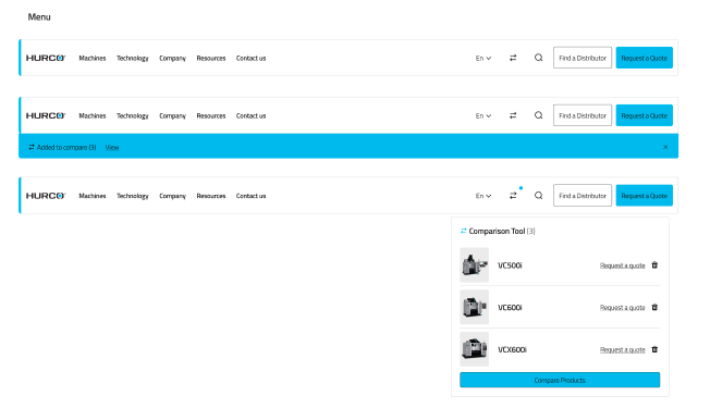
Desktop & Mobile Navigation
The primary global navigation system.
- Desktop: Horizontal layout with mega-menu support.
- Mobile: Collapsible hamburger menu with stacked links.

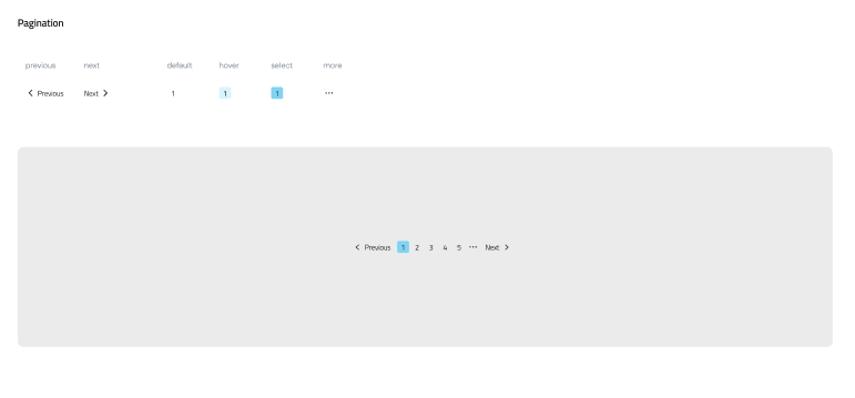
Pagination
Used for splitting large datasets into manageable pages. Includes "Previous", "Next", and direct page access.
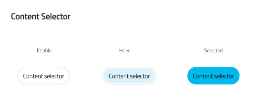
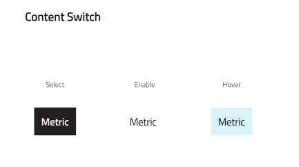
Content Switch & Selectors
Toggle between different views or categories of content without reloading the page.
Form & Data Entry
Standardized inputs for gathering user information.
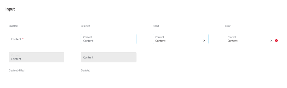
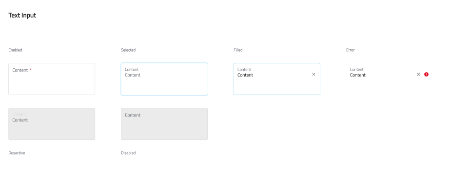
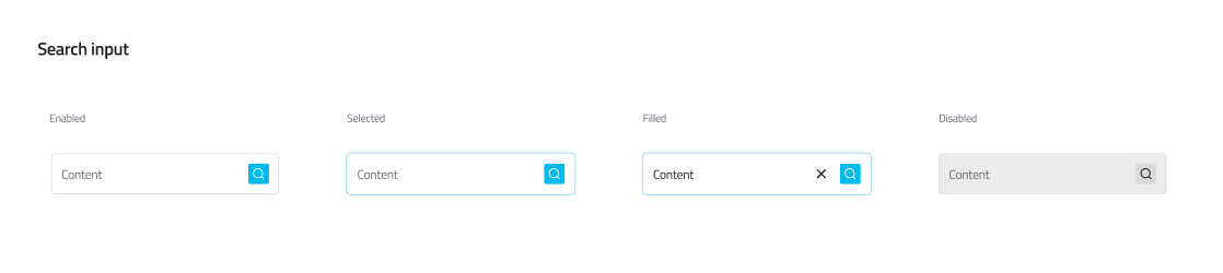
Text & Search Inputs
Standard text fields and specialized search bars with icon integration.
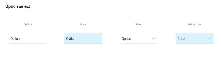
Selection Controls
Used when users need to choose one or more options from a set.
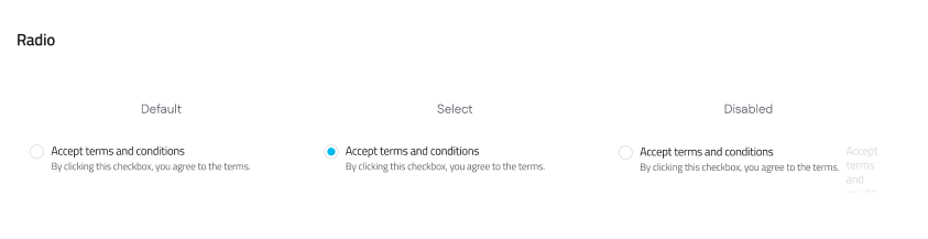
- Radio Buttons: Select one option from a list.
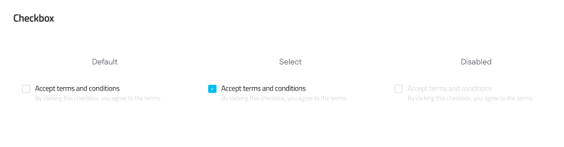
- Checkboxes: Select multiple options.
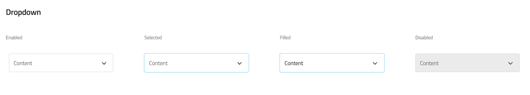
- Option Select/Dropdowns: Choose from a list in a compact format.
Actionable Elements
Buttons used to trigger events or navigate to specific destinations.
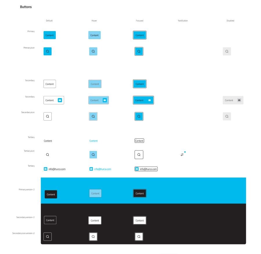
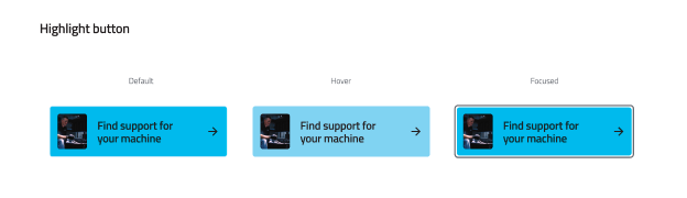
Primary & Highlight Buttons
Standard buttons come in various weights (Primary, Secondary, Ghost), while Highlight buttons are used for high-impact Call to Actions (CTAs).
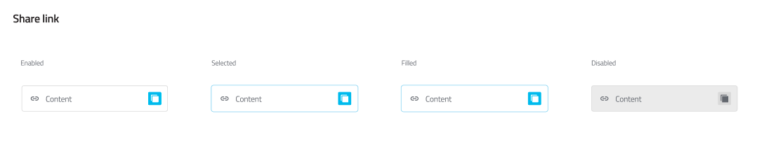
Share Buttons
Social sharing integration for content distribution.
Data Display & Layout
Components designed to organize and present information clearly.
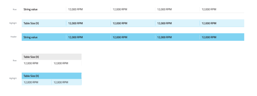
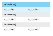
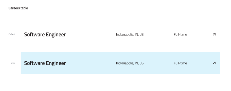
Tables
Used for structured data. Includes standard data tables and specialized variants like the Careers table.
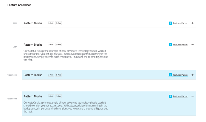
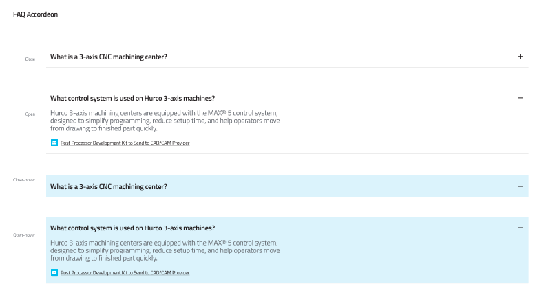
Accordions
Collapsible headers used to organize FAQs or feature lists to reduce vertical scrolling.
Maps & Location
Elements specifically designed for geographical interfaces.
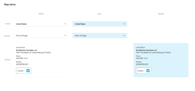
Map Pins & Items
Visual markers used to denote locations or points of interest on an interactive map.

Best Practices
- Consistency: Always use the defined button styles to maintain visual hierarchy.
- Accessibility: Ensure all form inputs have associated labels and focus states.
- States: Remember to design for Hover, Active, and Disabled states for all interactive elements.